The CAES Card Carousel block shows a row of cards that visitors can scroll through sideways. Unlike the other two slideshow-style blocks, you can build the inside of each card yourself: a heading, some text, an image, a button, or any combination of blocks that you need.
Use it for things like highlighting featured programs, staff spotlights, and more.
If you only want to make a slideshow of photos, use CAES Slideshow instead. If you want one large feature area at the top of a page that uses a call to action per slide, use CAES Hero instead.
How to add a card carousel
- Edit the page, and click the blue Block Inserter (+) button, and click the Patterns tab.
- Search for Card carousel and select it. You get four cards to start with, that all use a heading, paragraph, and button. If you don’t see it, it probably disabled by default. Contact caesweb@uga.edu or submit a work request for assistance.
- Once it’s inserted, click on the pattern and select “Edit Pattern” from the toolbar.
- Click into the first card and you can edit within it like any other part of the page. You can edit, add, and remove any block. Each card starts with a heading, a paragraph, and a button as a starting point; you can delete or replace them.
- To add another card, click the + at the end of the row.
- Or you can duplicate a card with its styles already applied by duplicating it from the Document Overview outline. Click “Document Overview” three lines on the left to see the page tree, expand “Card Carousel” and duplicate a “CAES Card”.
- To reorder cards, select one and use the arrows in its toolbar, or drag it and drop it in the Document Overview.
Settings
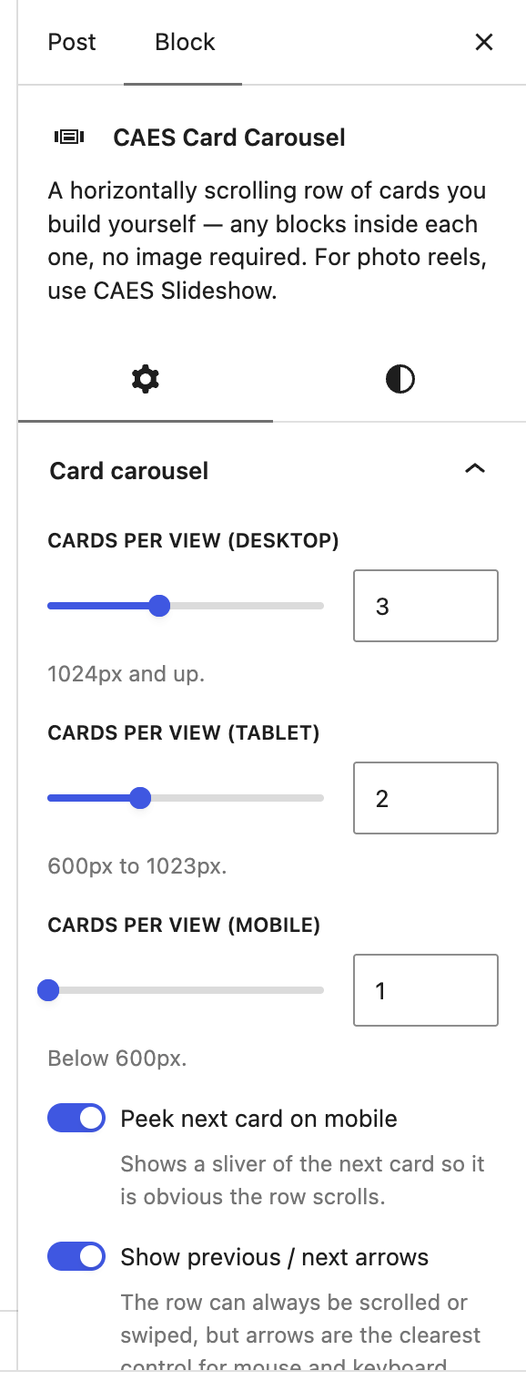
In the sidebar under Card carousel:
- Cards per view (desktop): how many cards are visible at once on a wider screen for desktop sizes.
- Cards per view (tablet): how many cards on a middle sized screen for tablets.
- Cards per view (mobile): how many cards on a small sized screen for mobile.
- Peek next card on mobile: shows a sliver of the next card on mobile, so it is obvious the row scrolls.
- Arrows move by: whether an arrow moves one card, or a full screen’s worth.
- Carousel label: describes the carousel for screen readers, for example “Featured programs”. Falls back to “Card carousel”, so it is worth setting when a page has more than one.
Styling cards
Select a single card and you can set its background colour, text colour, border, corner radius, padding and minimum height from the sidebar, the same as any other container block. Select the carousel itself to set the spacing between cards under Dimensions → Block spacing.
Cards in a row are stretched to match the tallest one, so a short card will not leave a gap.
Keep cards consistent
A carousel reads best when the cards are alike, with the same kind of content in the same order. Mixing a text-only card with an image-heavy one makes the row look broken rather than varied.
It’s also worth checking your carousel using the mobile preview in the editor. Cards that look comfortable three-across on a desktop can become very tall when they stack to one per row, so keep the text inside them short.
Accessibility
Two things to watch:
- Give the carousel a label. Screen reader users hear the label when they reach the block, and “Featured programs” is far more useful than “Card carousel”.
- Any image inside a card still needs alt text. Make sure to apply this to the image block when you add them.
