Attention CAES content managers: It’s important to stay up-to-date on web accessibility best practices! If you’re not already familiar, check out our resources on Web Accessibility 101 and Five Tips for More Accessible Web Pages. These articles cover best practices that apply to WordPress managed sites.

In this article, we’ll provide additional tips specific to WordPress that will help you ensure your website is accessible to all users.
Table of Contents
How to add alt text to images and image galleries
Alternative text on images is used to concisely describe images on a web page to visitors who use assistive technology, like screen readers. For more information about how to write alt text, please check out Five Tips for More Accessible Web Pages.
As for how to apply alt text in WordPress, you can use one of two methods:
Add in the media library
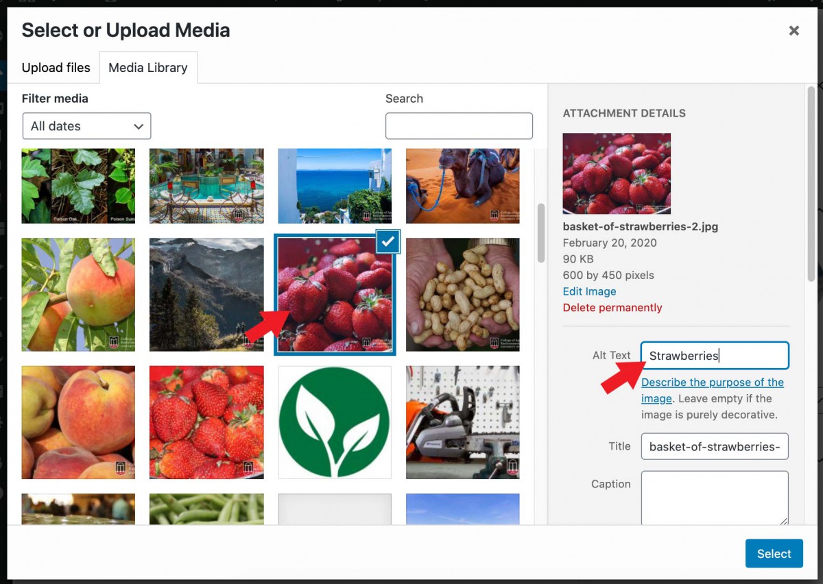
While adding the image from the media library:
- Select your image
- In “Attachment Details” on the right side, add the alt text to the “Alt Text” field
Add in the image block’s settings

Another method is while in the editor:
- Select the Image Block after adding it to the post or page
- In the “Block Settings” on the right, enter the alt text into the “Alt text (alternative text)” field.
Image Galleries
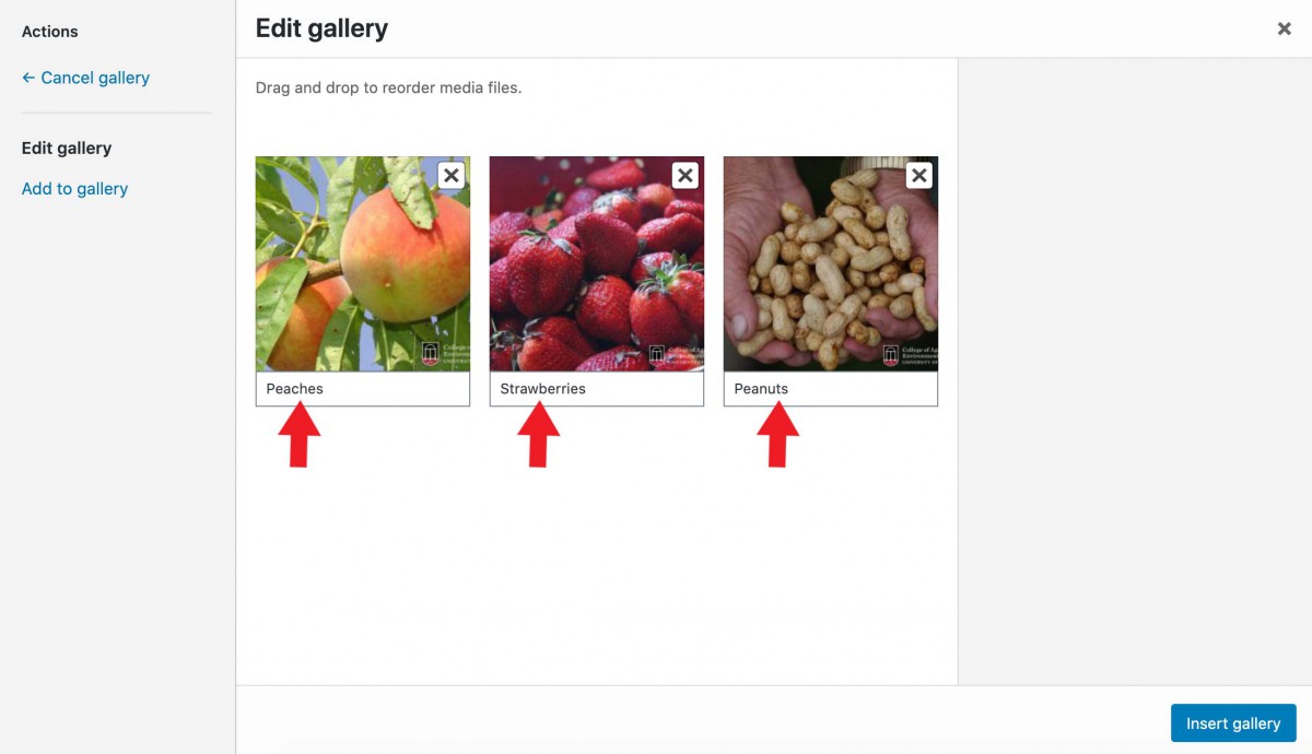
For image galleries, be sure to provide the caption text for each image.
Make text legible with high background contrast
The WordPress editor gives the option to change the background color and text color of different elements like Cover Blocks and Button Blocks.
It’s crucial to have sufficient color contrast between the background and text colors of your website’s content to ensure legibility and accessibility. When using the CAES Faculty 2023 theme, there are two methods you can use to achieve this:
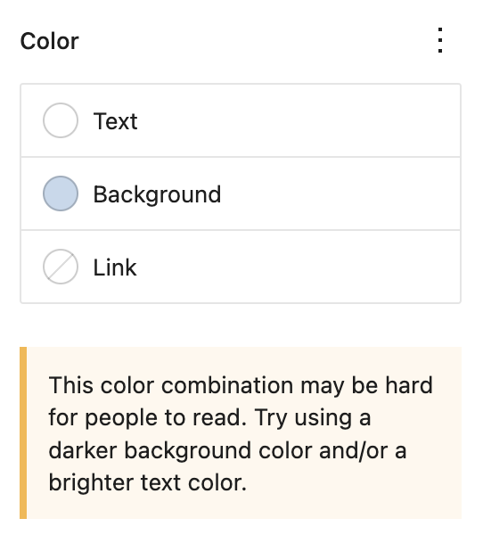
WordPress’ color contrast message
To ensure legibility and accessibility of your content, WordPress provides a helpful indicator that alerts you if the selected background and text colors may be difficult to read. If you see this message, it’s a good idea to review your block’s color settings.
Know what colors contrast with the primary, secondary, and tertiary colors
Each color scheme choice in the CAES Faculty 2023 theme has three colors. The first two colors are named primary and secondary. The third color is named tertiary.
For blocks with a primary or secondary background color, use white text to ensure adequate color contrast. If you use a tertiary color as the background, opt for black text to achieve sufficient contrast.
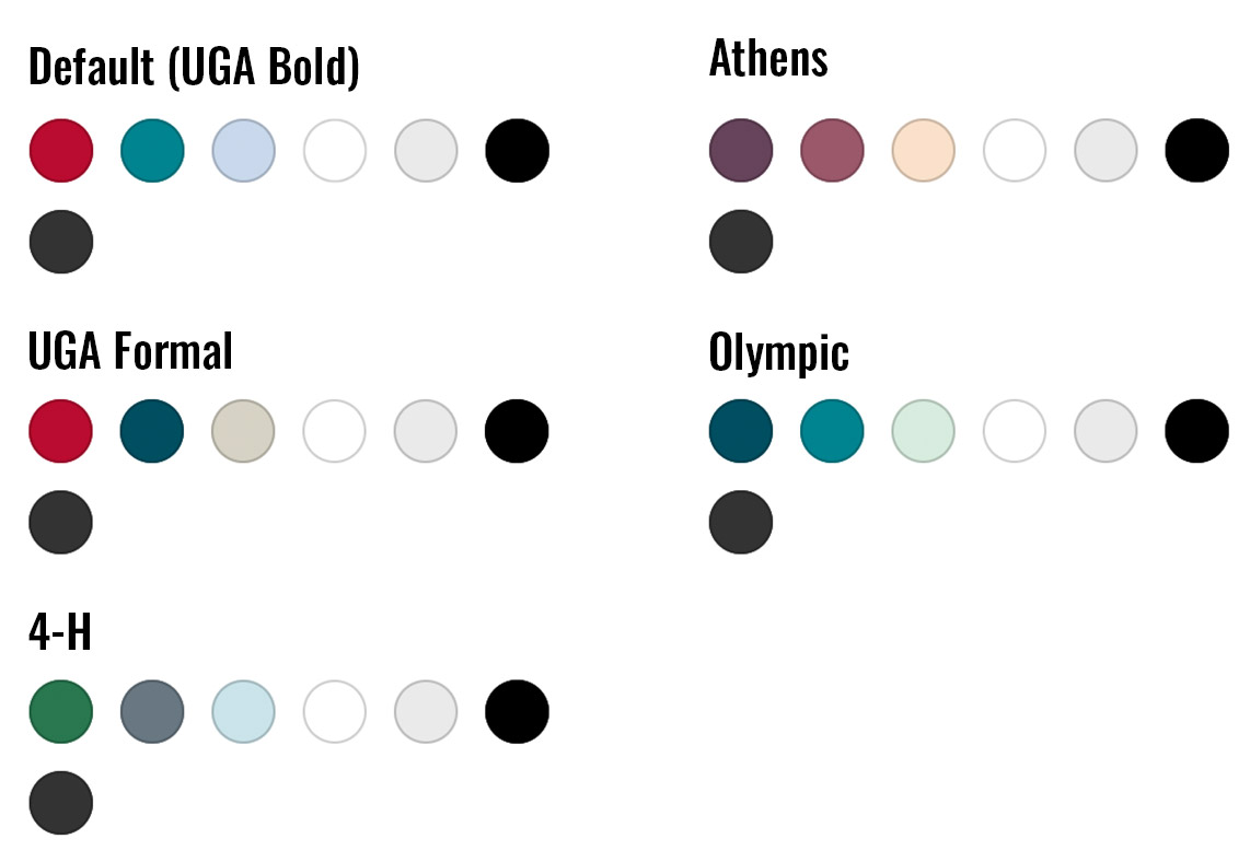
Here’s an example of the primary, secondary, and tertiary colors that come with the CAES Faculty 2023 theme, and their contrasting text colors:
Primary Color
Use white text when you use the first color (“Primary”) of any color palette available in the CAES Faculty 2023 theme.
Secondary Color
Use white text when you use the second color (“Secondary”) of any color palette available in the CAES Faculty 2023 theme.
Tertiary Color
Use black text when you use the third color (“Tertiary”) of any color palette available in the CAES Faculty 2023 theme.
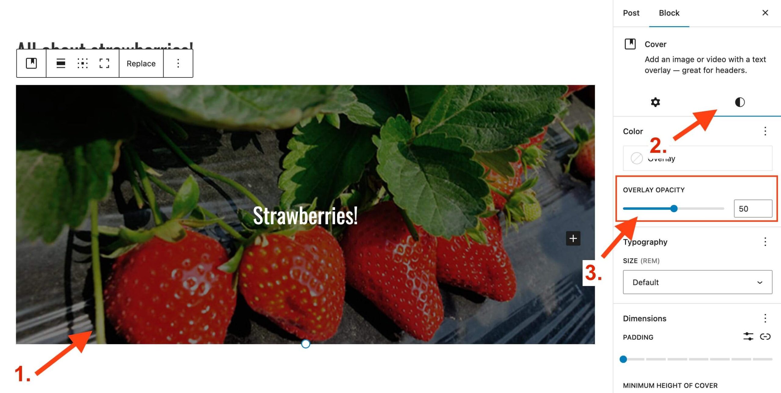
Be careful with background images on Cover Blocks
While image backgrounds can give your website a modern appearance, it’s important to exercise caution when using them. Achieving high contrast with photo backgrounds can be challenging because they contain a wide range of colors, unlike single-color backgrounds.
WordPress allows you to add banners to a page’s content. In the editor these are called Cover Blocks. To make accessibility easier, the editor includes an overlay opacity setting on Cover Blocks.
The overlay adds a semi-transparent background color over the photo. This helps improve contrast, and the overlay’s opacity can be adjusted to be darker or lighter via the block’s settings.
You can adjust the overlay’s opacity with these steps:
- Select the Cover Block after adding it to the page
- In the Cover Block settings on the right, click the “Styles” tab
- Adjust the opacity with the “Overlay Opacity” setting
Include an H1 block when you use the “Blank” page template
In some cases you may choose to use the “Blank” page template when designing a page. This option hides the page’s built in title, or H1 heading. It’s useful when you want to feature a Cover Block at the top of the page for a modern look.
However, this option should be used carefully. H1 headings are an important landmark on webpages that let assistive technology users know where your content begins. So if we remove the built in H1 heading, we need to add one back in by using a H1 heading block.
Basically, if you use the “Blank” page template to feature a Cover Block at the top of the page, make sure your Cover Block includes an H1 heading block for the title of your page. The H1 should come before any other content on the page.
Have accessibility questions?
Have any questions about the accessibility of your CAES or Extension website? We’re here to help. You can reach the CAES Web Team at caesweb@uga.edu.