The CAES Before-After Slider lets you stack two images and compare them with a divider that visitors can drag. As they slide the divider left and right, one image is revealed and the other is hidden. It works well for showing change over time or comparing a treatment to a control.

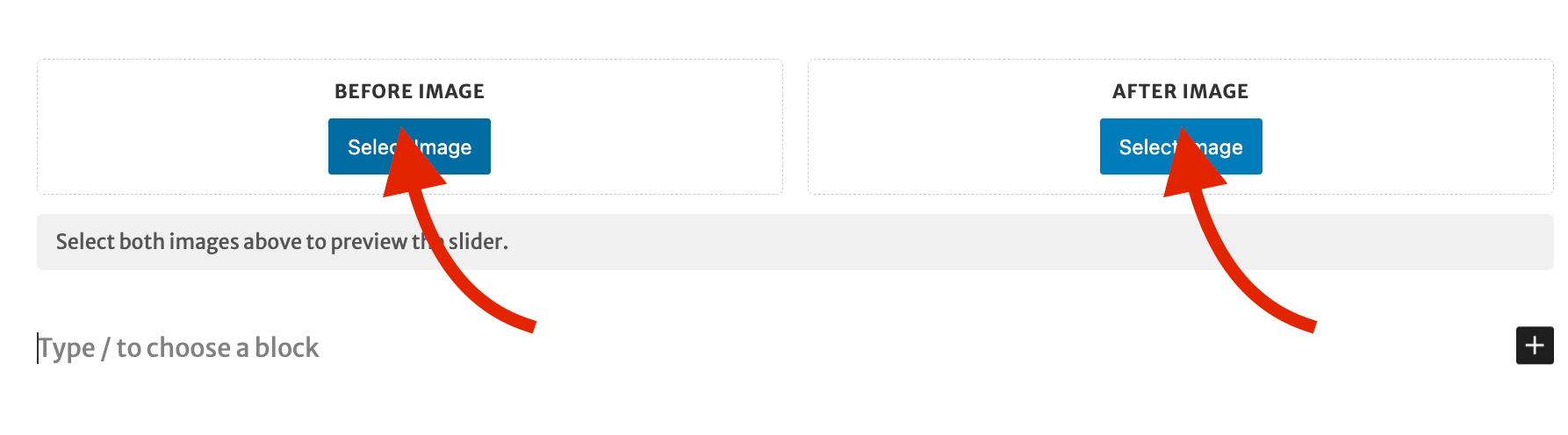
1. Add the block and choose your images

  1. Add a new block and search for “Before-After Slider”. You will find it in the Media category.
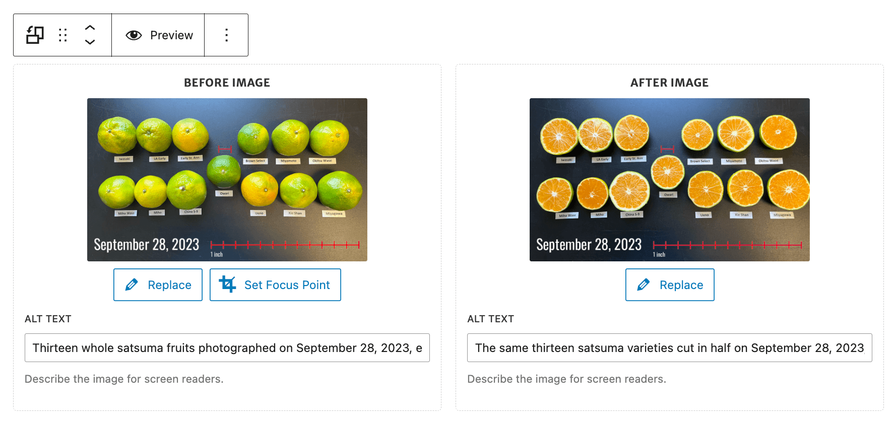
  2. In the Before Image slot, click Select Image. This image shows on the left of the divider.
  3. In the After Image slot, click Select Image. This image shows on the right.
  4. Fill in the Alt Text field under each image to describe it for screen reader users.
The Before-After Slider block right after it is added, with empty Before Image and After Image slots side by side. A red arrow points to the Select Image button in each slot. A message below reads, "Select both images above to preview the slider."
Click Select Image in each slot to add your before and after photos.
The Before-After Slider block with both images selected. Each slot shows a thumbnail of the labeled satsuma photo. The Before Image has Replace and Set Focus Point buttons, and the After Image has a Replace button. An Alt Text field sits under each image, and the block toolbar at the top includes a Preview button.
Once both images are added, each slot shows a thumbnail, an Alt Text field, and buttons to replace the image or adjust its focus point.

Tip

Use two photos shot from the same angle and distance. The comparison lines up best when both images match.

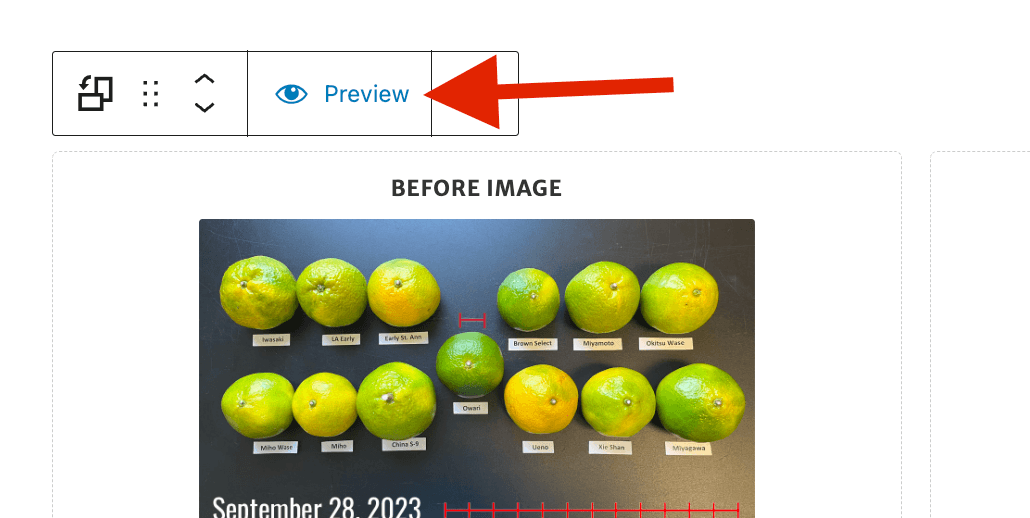
2. Preview the slider

Previewing lets you test the slider the way a visitor will use it, before you publish.

  1. With both images set, click Preview (the eye icon) in the block toolbar.
  2. The block turns into a working slider. Drag the handle to test the comparison.
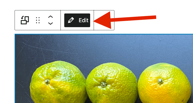
  3. Click Edit (the pencil icon) to go back to swapping images.
The Before-After Slider block toolbar with a red arrow pointing to the Preview button, which has an eye icon. The block below is still in editing mode, showing the labeled Before Image.
Click Preview (the eye icon) to switch the block into a working slider.
The Before-After Slider block toolbar with a red arrow pointing to the Edit button, which has a pencil icon and is highlighted. The block below now shows the live slider instead of the editing view.
While previewing, click Edit (the pencil icon) to go back to swapping images.

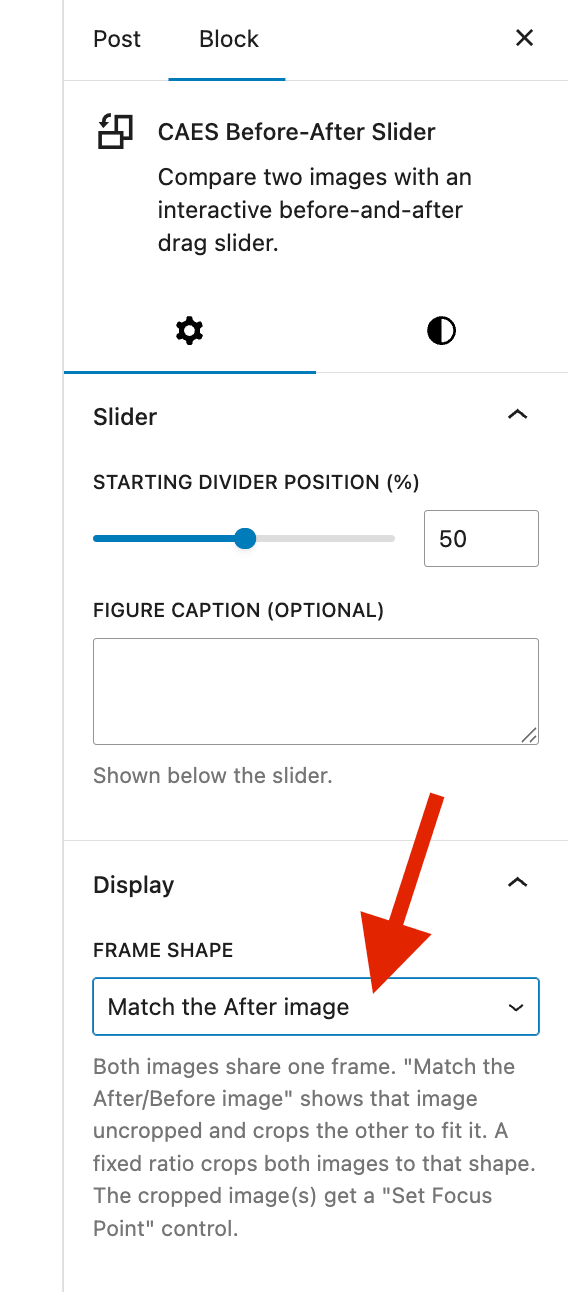
3. Set the frame shape

Both images sit inside one shared frame, so the block needs to know what shape that frame should be. Open the Display panel in the sidebar and set Frame shape:

  • Match the After image (default). The After image shows in full, and the Before image is cropped to fit.
  • Match the Before image. This does the opposite. The Before image shows in full, and the After image is cropped to fit.
  • A fixed ratio (16:9 Widescreen, 4:3 Classic, 3:2 DSLR Photo, 1:1 Square, 2:3 Portrait). Both images are cropped to that shape.

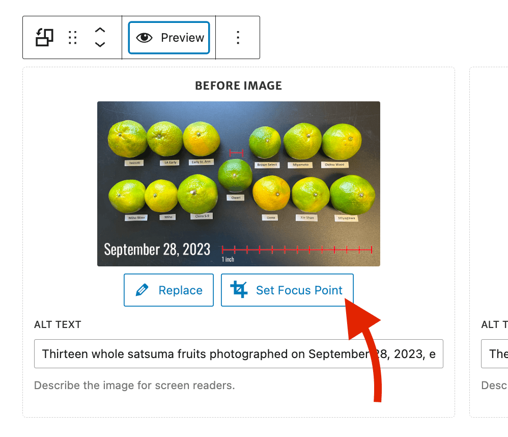
Note that whenever an image gets cropped, a Set Focus Point button appears for it. See the next step.

The Block settings sidebar for the CAES Before-After Slider. The Slider panel shows the Starting divider position set to 50 and an empty Figure caption field. Below it, the Display panel is open with a red arrow pointing to the Frame shape dropdown, which is set to "Match the After image".
Open the Display panel and set Frame shape to control how the two images are cropped.

4. Set the focus point on cropped images

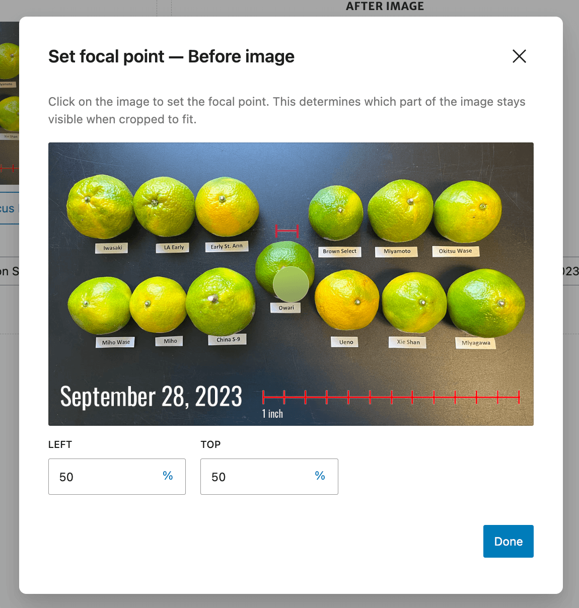
The focus point tells the block which part of a cropped image to keep in view, so the important part does not get cut off.

  1. Click the Set Focus Point button on a cropped image.
  2. Drag the marker over the most important part of the photo, such as a face or a building.
  3. The block keeps that spot in view as it crops.
The Before Image slot of the slider block with a red arrow pointing to the Set Focus Point button, which sits next to the Replace button below the image thumbnail.
Click Set Focus Point on a cropped image to choose what stays in view.
The Set Focal Point dialog open over the Before image. Instructions at the top read, "Click on the image to set the focal point. This determines which part of the image stays visible when cropped to fit." A round marker sits on the photo, and the Left and Top fields below both show 50 percent, next to a Done button.
Drag the marker over the most important part of the photo, then click Done.

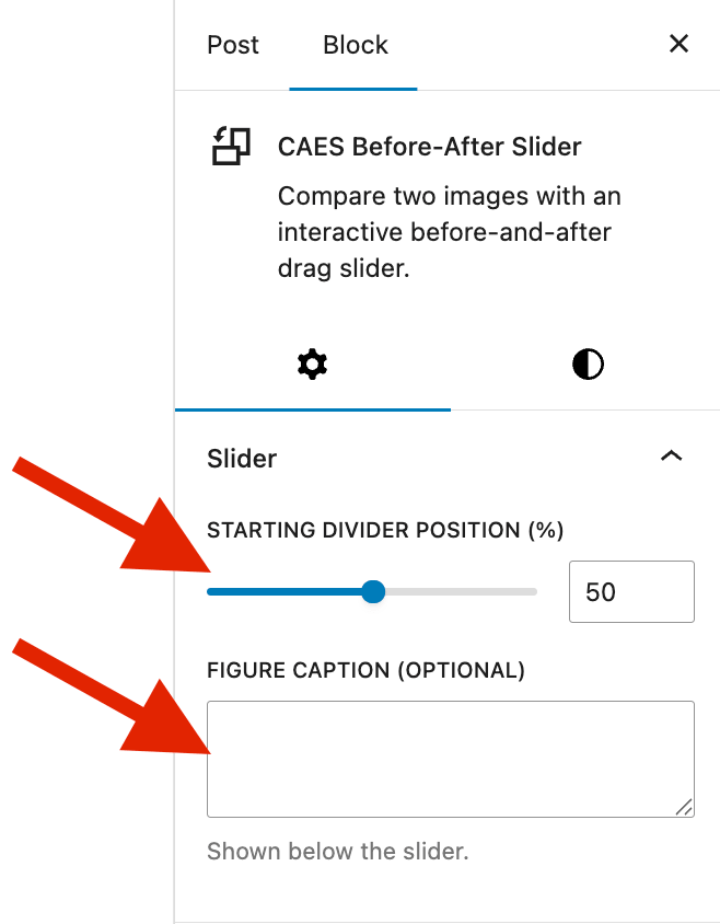
5. Adjust the slider options

Open the Slider panel in the sidebar:

  • Starting divider position (%). This sets where the divider sits when the page first loads, from 5 to 95. A lower number shows more of the After image. A higher number shows more of the Before image.
  • Figure caption (optional). This text shows below the slider.
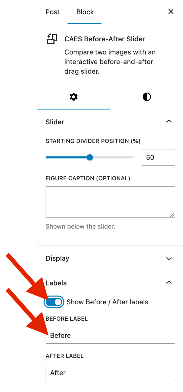
The Slider panel in the Block settings sidebar, with red arrows pointing to the Starting divider position slider, set to 50, and to the empty Figure caption field below it.
Set where the divider starts and add an optional caption in the Slider panel.

6. Add labels

Labels are small tags that sit on top of each image, so visitors can tell at a glance which side is which. Open the Labels panel to add them:

  1. Turn on Show Before / After labels.
  2. Edit the Before label and After label text. The defaults are “Before” and “After”.

The labels sit on top of each image and move with the divider.
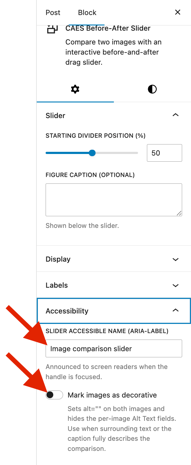
The Slider panel in the Block settings sidebar, with red arrows pointing to the Starting divider position slider, set to 50, and to the empty Figure caption field below it.
Set where the divider starts and add an optional caption in the Slider panel.
The Labels panel open in the Block settings sidebar. A red arrow points to the "Show Before / After labels" toggle, which is turned on, and a second arrow points to the Before label field, which reads "Before". The After label field below it reads "After".
Turn on Show Before / After labels, then edit the label text if you want something other than the defaults.

7. Accessibility

These settings make sure screen reader users get the same information sighted visitors do. Open the Accessibility panel:

  • Slider accessible name (aria-label). This is read aloud to screen reader users when they focus the divider handle. Make it meaningful, like “Before and after of the renovated garden”.
  • Mark images as decorative. Turn this on only when the text around the slider or the caption already describes the comparison in full. It sets empty alt text on both images and hides the per-image Alt Text fields.
The Accessibility panel open in the Block settings sidebar. A red arrow points to the Slider accessible name field, which reads "Image comparison slider", and a second arrow points to the "Mark images as decorative" toggle, which is turned off. Helper text below the toggle notes that it sets empty alt text on both images and hides the per-image Alt Text fields.
Give the slider a meaningful accessible name. Only mark the images as decorative if the text or caption already describes the comparison.

Quick checklist

  • Both Before and After images are selected
  • Alt text is written, or the images are marked decorative
  • Frame shape is chosen, and focus points are set for any cropped image
  • You previewed the live slider
  • Labels and a caption are added if you want them
  • The accessible name is filled in
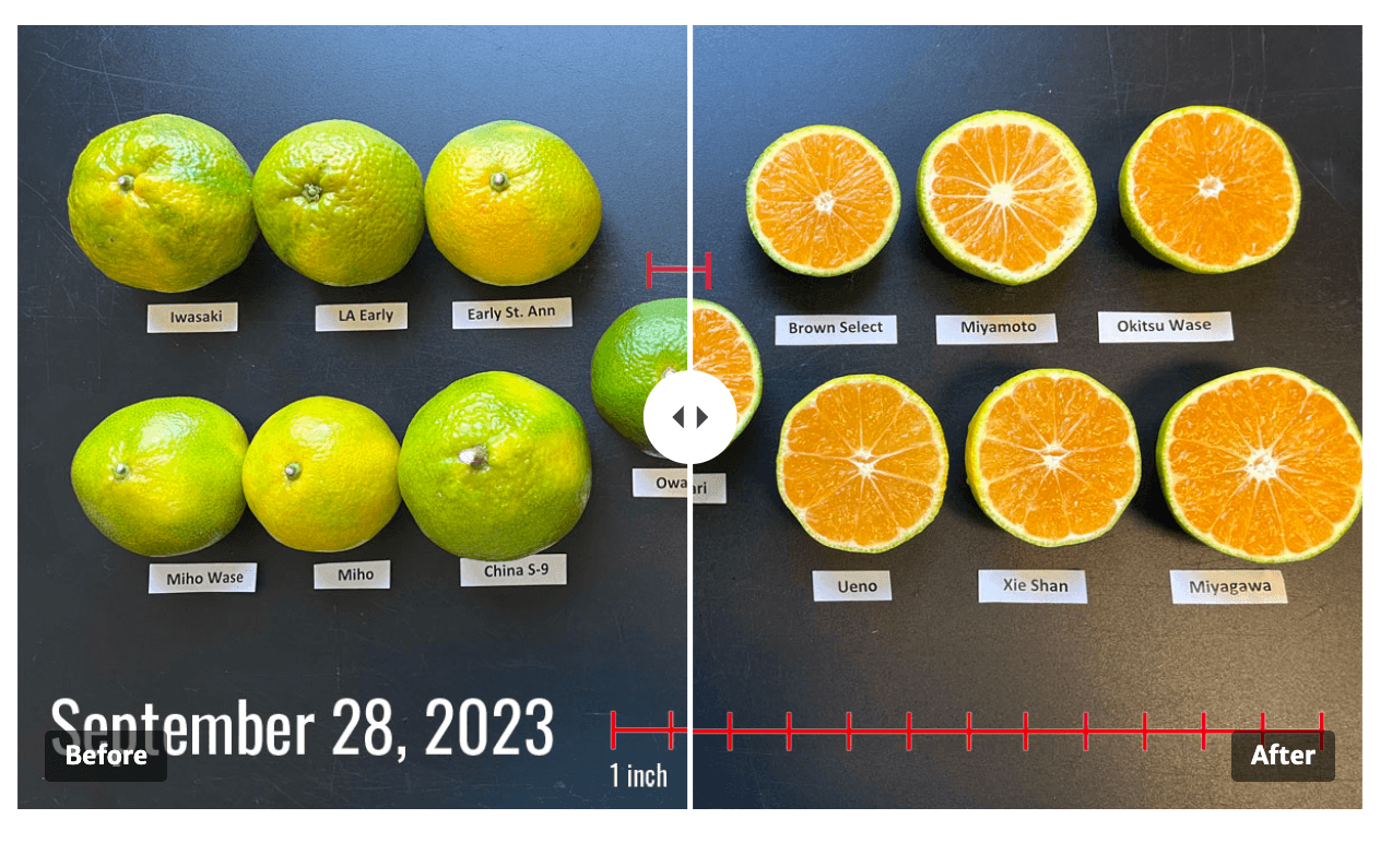
See it in action

Here is a finished slider. It compares the outside and inside of early-maturing satsuma varieties grown in southern Georgia, with ‘Owari’ in the center for reference. Drag the divider to move between the peel color and the cut fruit. The photos come from the UGA Extension publication Comparing Early-Maturing Satsumas to ‘Owari’ in Southern Georgia.

Before: Thirteen whole satsuma fruits photographed on September 28, 2023, each labeled with its variety name and shown next to a one-inch scale bar. Most fruits are light green with yellow starting to show through. 'Owari', in the center, is still solid dark green. 'Miho' and 'Ueno' have a little more yellow than the rest.
After: The same thirteen satsuma varieties cut in half on September 28, 2023, each labeled and shown next to a one-inch scale bar. Every fruit interior is a bright, even orange, including 'Owari' in the center, even though most of the peels are still green.
Posted in: