Maps are a common way to communicate statewide impact, but they often rely entirely on visual interpretation. This case study highlights how a Georgia county heat map image was updated to meet accessibility requirements under WCAG 2.1 and ADA Title II.
The goal was simple: ensure that all users—regardless of how they access content—can understand and use the same information.
How we remediated a data visualization to meet accessibility standards:
The Problem
A Georgia county heat map was used to show agricultural impact, but all information was communicated visually through color.
This created barriers for users who:
- Use screen readers
- Have low vision
- Cannot distinguish color differences
The map did not meet WCAG 2.1 requirements because the image was the only way to access the data.
The Fix
Instead of redesigning the map, we added equivalent ways to access the same information:
- Alt text describing the purpose of the map
- Short summary of key insights
- Full data table with county-level values (required)
Before vs. After
Before: What was not accessible
Issues:
- Image only
- Color-dependent
- No data access for screen readers
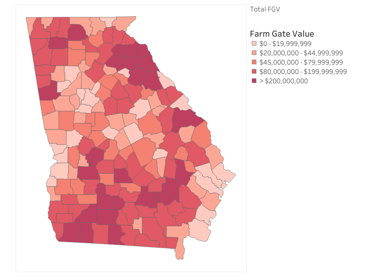
Impact:
Users who could not see or interpret the image had no access to the underlying data.
After: What changed
Accessibility was achieved not by altering the image itself, but by adding equivalent ways to access the same information.
- Image + text + data
- Information available to all users
- Meets accessibility requirements
Total Farm Gate Value: $18,034,813,489
The heat map below shows each county’s contribution to Georgia’s total farm gate value, highlighting the important role agriculture plays in local economies across the state.
Key Takeaways for Content Creators
When using a static map or heat map image:
Always include:
- Meaningful alt text
- A text version of the legend
- A brief summary of what the map shows
- A full data table with the same information
Avoid:
- Relying on color alone
- Assuming alt text is sufficient for complex visuals
- Putting critical information only inside an image
Bottom Line
If users cannot access the data without seeing the image, the content is not accessible.
Accessible maps provide more than a visual—they provide equal access to the information.
