As we communicate through email, it’s important to ensure our messages are inclusive and accessible to all readers, including those with disabilities. Both emails to clients and internal CAES audiences must be made accessible. This article will go over ways to incorporate accessibility into your emails and newsletter campaigns.
Digital Accessibility is a Federal Requirement
It is federal law that our digital content (including emails) are accessible to people with disabilities.
Table of Contents
Don’t Use Images of Text
Avoid using images of text in emails because they are inaccessible to screen readers and other assistive technologies. When text is embedded in an image, it cannot be read aloud or resized, making it difficult for individuals with visual impairments. Instead, use plain text in the body of your email to ensure that all recipients can access and understand your message.
Never convey critical information with an image alone – make sure to include the information as text.

Don’t do this. The example above shows a drafted email in Outlook that uses an image to convey information. Since the details of the Junior Conference are embedded in the image, a screen reader can’t read them.

For a screen reader user, the image essentially appears like the one above. They won’t be able to read the image, rendering the information inaccessible.
You can use images and photos in your emails. However, they should not be used to convey the information of the email, and they must include alt text (we’ll cover that in the next section).
Here’s an improved example:

The improved example shown here includes an eye-catching header graphic at the top. It has a little bit of text embedded in it. Short text on a graphic, like a call to action, is fine! Just make sure that:
- Information is included as text in the body of the email, as seen in the example.
- Header graphics include alt text that match the text embedded on the image. In this case, it would be “The Adventure of a Lifetime with Georgia 4H – Junior Conference 2022”.
Include Alt Text With Images
Including alternative (alt) text for images in your emails is crucial for accessibility. Alt text provides a textual description of the image content, allowing screen readers to convey the information to visually impaired users. This practice ensures that all recipients, regardless of their ability to see the images, can understand the context and purpose of the visuals in your email. For more information on how to add alt text, and how to write it, please check out these resources:
Use Readable Font Format and Color
Choosing a readable font format and color is essential for creating accessible emails:
- Use a sans-serif font like Arial, Verdana, or Aptos.
- Use font sizes no smaller than 12pt.
- Use high color contrast for the text against the background to enhance visibility. Black text on a white background is a safe choice.
- If using other colors for text and its background, use the WebAIM Color Contrast Checker to ensure the colors have sufficient contrast. A color contrast ratio of 4.5:1 is required for text smaller than 14 pt, and 3:1 for larger than 14 pt.
- Left-align bodies of text and use sufficient line spacing (1.5x) to improve readability for individuals with dyslexia or cognitive impairments.
Don’t Use Color to Convey Meaning
Relying solely on color to convey meaning in emails can be problematic for colorblind individuals. Important information should not be dependent on color cues alone. Instead, use text labels, patterns, or other visual indicators alongside color to ensure that the message is clear to everyone.
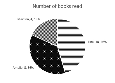
In this example, the image of the piechart uses text labels next to each wedge in order to convey the data without relying on color. Patterns can also be used in addition to color, if using a key, instead of using text labels next to the data.
Use Emojis With Care
When incorporating emojis into your emails, use them mindfully to enhance, rather than obscure, your message.
- Use emojis sparingly.
- Use emojis at the end of a message, instead of in between words.
- Don’t use emojis to replace words.
- Don’t use emoticons (such as “:-)” or “:D”). These lose their meaning when read aloud by a screen reader.
Use Descriptive Links
Using descriptive hyperlink text (the underlined text you click to follow a link) in your emails improves accessibility by providing clear, meaningful context about the destination or purpose of the link.
- Avoid generic hyperlink text like “click here” or “here”.
- Instead, use descriptive text that lets the user know where the link takes them. E.g. “Vegetable Garden Calendar” or “Sign Up for Summer Camp”.
- Avoid simply pasting the URL as the hyperlink text.
Avoid Tables When Possible
Tables introduce a number of complexities for accessibility. For example, fixed width tables can be difficult to resize for enhanced legibility, and an improperly formatted table without a header can be difficult to navigate and read for screen reader users. When possible, considering conveying information another way, such as through lists and paragraphs.
If using a table can’t be avoided:
- Don’t set a fixed width on the table.
- Make sure to use table headers: Table headers in Outlook
Use An Accessibility Checker When Available
Built-in accessibility checkers can help you identify and rectify issues in your email. To learn how to use the accessibility checker in Outlook, check out Microsoft’s article here: Accessibility checker in Outlook.
Additional Resources
Have Questions About Digital Accessibility?
Check out our Accessibility & Section 508 Articles, or contact the CAES Web Team if you have any questions.