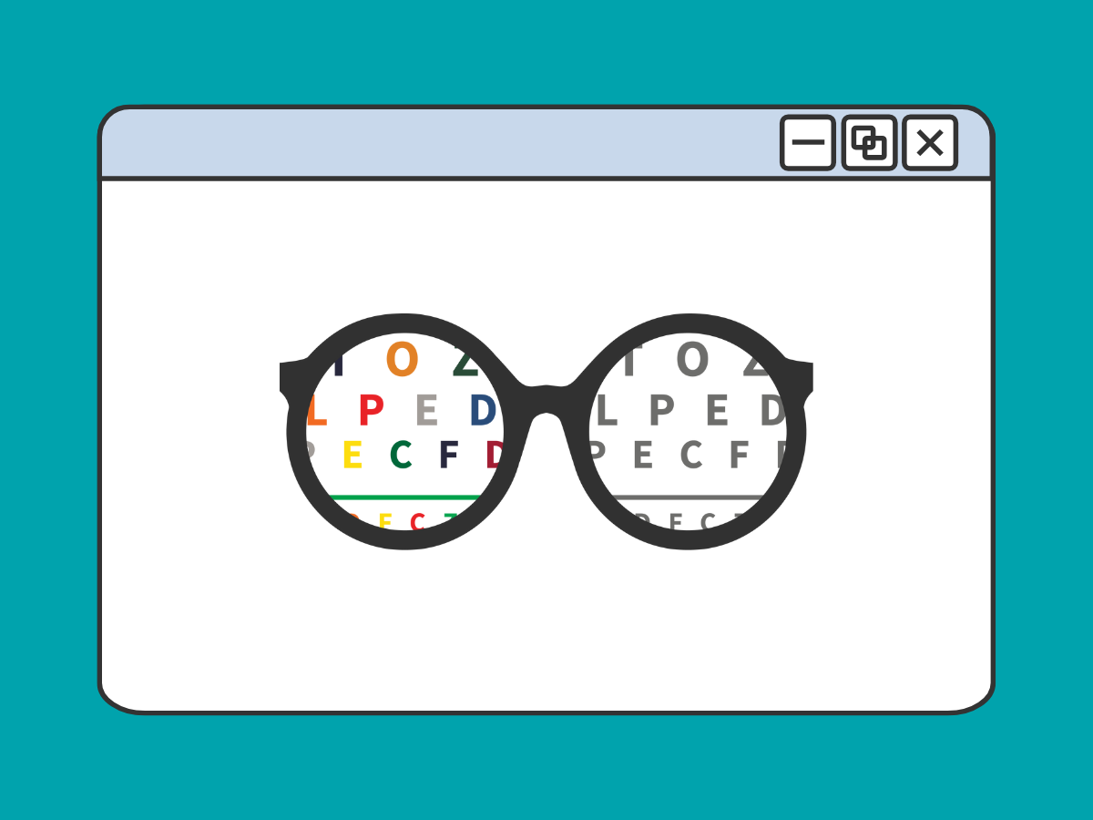
The way we use color also has an impact on digital accessibility. Let’s go over what to consider when using color on your digital communications.
Use Enough Color Contrast
Make sure the text in your communication has sufficient color contrast against the background. Minimum color contrast requirements ensure that text and important elements are readable against their background, meeting the WCAG standard. This requires a contrast ratio of at least 4.5:1 for normal text and 3:1 for large text (18pt and larger, or 14pt bold and larger).
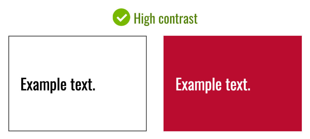
Good Examples With High Color Contrast
Here are some examples of text with high contrast that is accessible:
- Black text on a white background
- White text on UGA red (“Bulldog Red” in UGA color palette)
- Stick with high contrast color combinations!
Bad Examples With Low Color Contrast
Here are some examples of text with low contrast that is NOT accessible:
- Grey text on a white background
- White text on a light blue background (“Odyssey” in UGA color palette)
- Text on top of a busy photo background
- Avoid low contrast color combinations!

Tools for Checking Color Contrast
WebAIM Color Contrast Checker
CAES and UGA Extension website and Canva templates have accessible color schemes built-in. However, if you’re creating an infographic or a PDF without the use of a template, you should use the WebAIM Color Contrast checker tool to verify your colors are compliant:
- Visit the Website: Go to the WebAIM Color Contrast Checker site.
- Select Colors: Enter the color codes or use the color picker to choose your text and background colors.
- Check Contrast Ratio: The tool calculates the contrast ratio and provides feedback on whether the colors meet accessibility standards.
- Interpret Results: Ensure the contrast ratio is at least 4.5:1 for normal text and 3:1 for large text (18pt and larger, or 14pt bold and larger). Green indicates passing, and red indicates failing.
- Adjust as Needed: If the contrast fails, adjust colors and recheck until compliance is achieved.
Color Alone is Not Enough to Convey Information
Color should not be the sole method of conveying information in graphics, charts, and other visuals. Using color reliance alone is a barrier for colorblind and low vision users who may not perceive color differences. Color differences are also not conveyed by a screen reader to users with visual impairments.
Don’t Do This
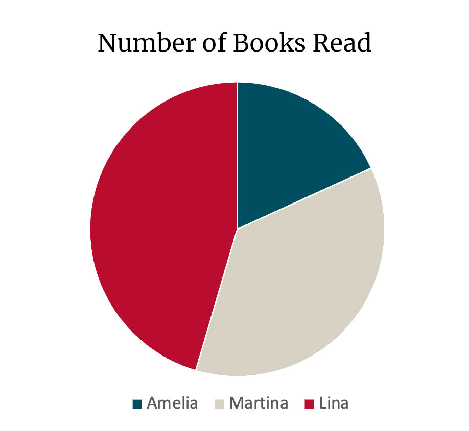
- The above chart only uses a color legend to show how many books each person read.
- There are no other cues to help connect sections of the pie to people who have read a book.
- Since only color is used to convey this information, a person who cannot perceive color differences will have difficulty reading the chart.
- There is no text equivalent of the chart for screen readers. Since the chart is an image, there should be an accompanying text version of the information on the page.
Instead, Do This
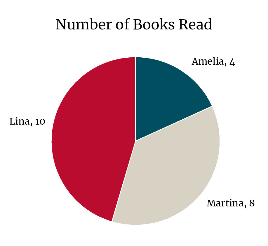
| Reader | Number of Books Read |
| Lina | 10 |
| Amelia | 4 |
| Martina | 8 |
- The pie chart above uses explicit text labels next to each wedge. This helps visually connect data to each piece of the pie without relying on color.
- The chart image’s alt text indicates that the table following represents the data: “Data for chart is located in the table after this image.”
- Below the image of the chart, a table is included for screen readers. The table itself is properly formatted with a header row. This meets the requirement for providing a text equivalent for the information in the chart.
The bottom line:
- Don’t use color alone to convey information
- Provide a text description or table for screen readers